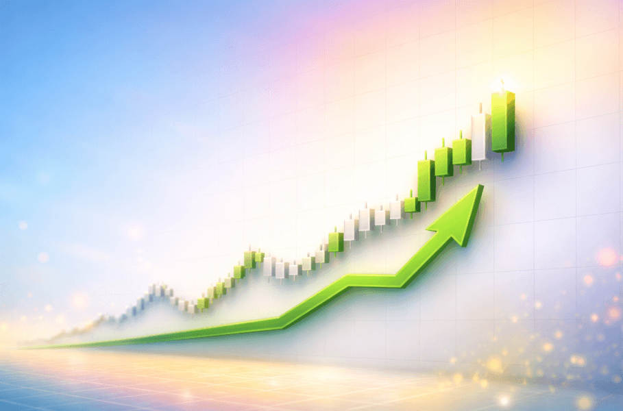
Have you ever wondered why some people in Slovenia create entire fortunes with cryptocurrencies, while others simply watch their money disappear? The secret isn’t luck — it’s that they know how to read a chart correctly.
A chart is essentially a “money map.” If you know how to read it, you can see where the big players (so-called whales) decided to buy and where they will sell. In this article, we won’t waste time on dry theory. The focus is on practical application: how to open a chart, what to look for in it, and how to turn that knowledge into euros in your bank account.
If you want to skip years of learning from your own mistakes, download this e-book
Why is the chart your most important tool?
When you enter the world of cryptocurrencies, you are bombarded with news on Twitter, YouTube, and in the media. This news is often biased. The only thing that never lies is the chart. The chart is a visual record of every cent that has been invested in or taken out of the market.
Understanding psychology through an image
A chart is not just a collection of numbers. It is a display of human emotions.
When you see a steep rise, you see greed.
When you see a sharp drop, you see fear.
To make money, you need to be able to interpret these images with a cool head. Beginners often buy cryptocurrency when all the media are writing about it. At that point, the chart is usually already at its peak. Successful investors look at the chart and seek opportunities when prices are low and everyone else is scared.
Anatomy of a Chart
To even know what you’re looking at, we need to break down the basic parts of every chart.
Every chart has two axes. The vertical (right) axis shows the price, while the horizontal (bottom) axis shows time. This may seem obvious, but the key is in how you connect this data.
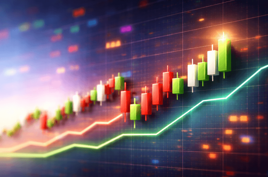
What are Candlesticks (Japanese Candlesticks)?
These are the red and green rectangles that form the foundation of all serious trading. Each candlestick tells us a story about a specific time period (e.g., one day).
The body of the candlestick: The thick part of the candle. It tells us where the price started and where it ended.
The wick or shadow (Wick): Thin lines protruding from the body. They show us how far the price momentarily jumped, but could not sustain that level.
Practical application: If you see a red candlestick with a very long lower wick, it means that sellers pushed the price strongly downward, but buyers rushed in at the same moment and pushed it back up. This is often the first sign that the price is about to reverse upward.
Timeframes
This is the button at the top of the chart that completely changes your perspective.
Daily chart (1D): Each candle represents one day. This is best for beginners, as it shows a realistic picture of the market without too much noise.
Hourly chart (1H): Each candle represents one hour. Useful for those who want to profit within a few days.
15-minute chart (15M): For those who want to trade quickly within a single day. Warning: Beginners most commonly lose money on these short charts because the moves are too fast.
Key Tools for Predicting Growth: Support and Resistance
Support – Your Safety Net
Imagine the price is falling. Support is the “invisible floor”, where the price repeatedly stops and bounces back up. Why? Because people (and algorithms) at this point see the cryptocurrency as “cheap” and start buying en masse.
How to profit: Find a level on the chart where the price has already bounced upward 2 or 3 times in recent months. Set your buy order just above that level.
Resistance – Your Glass Ceiling
This is the opposite of support. It is the level where the price repeatedly stops when rising. Here, people sell to take profit.
How to profit: When the price approaches this level, it is time to sell and pocket the money. Do not wait for the price to crash.
RSI Indicator: How to Know When the Market Is “Overheated”?
RSI (Relative Strength Index) is your most important detector for identifying the ideal moment to buy or sell. Beginners often buy when the price is already rising sharply, which is a mistake. RSI tells you when the market is “overheated” (greed) and when it is “undercooled” (fear).
Where exactly to find RSI in TradingView?
Indicators button: At the top of the toolbar, click on the “Indicators” icon (located between the chart symbol and the templates icon).
Search window: A new window titled “Indicators, metrics, and strategies” will open. In the search field where it says “Search”, type the abbreviation “RSI”.
Selection: From the results under the “Technicals” tab, select “Relative Strength Index”.
Appearance on the chart: The indicator will automatically appear in a new lower window beneath your main cryptocurrency chart. You will see a line moving in a range between values 0 and 100.
How to actually profit with the RSI indicator?
Once you have RSI set up, use it as a traffic light for your investments.
Zone below 30 (Buying opportunity): When the purple RSI line drops below 30, we say the cryptocurrency is “oversold”. This means everyone has been selling in panic and the price is likely lower than its real value. This is the moment when you enter the market and buy cheap, as a bounce upward is usually in the making.
Zone above 70 (Sell warning): When RSI rises above 70, the cryptocurrency is “overbought”. Euphoria rules the market, everyone is buying and the price is “overheated”. This is the worst time to buy. If you already hold the cryptocurrency, this is a signal to consider selling and pocketing your profit before the market corrects downward.
A practical trick for beginners: “Divergence”
If you notice that on the main chart the Bitcoin price is still falling, but the RSI line is already starting to rise, this is an extremely powerful signal. It tells us that the sellers are losing strength and that a major rally is just around the corner.
More about earning with cryptocurrencies here
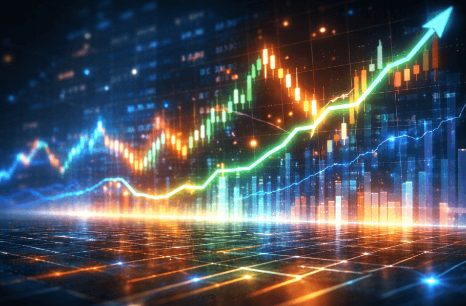
Understanding the Trend: Follow the Direction of Money
“Trend is your friend.” This is a phrase you will hear from every millionaire in the crypto world. On a chart, we distinguish three states:
Uptrend
The price makes higher highs and higher lows. On the chart, you see this as steps leading upward. This is the easiest period to profit. Simply buy at every minor dip.
Downtrend
The price makes lower highs and lower lows. This is a dangerous period. Do not try to “catch a falling knife”. Wait for the chart to show signs of stabilization before investing money.
Consolidation
The price moves in a narrow channel between support and resistance. This is the period when “whales” are preparing for the next big move. When the price breaks out of this channel upward (Breakout), explosive growth usually follows.
A Practical Profit Example: The “Breakout” Strategy
Let me explain a concrete technique you can use immediately after reading this article.
Open the chart for any coin on the TradingView website.
Find a period when the price moved horizontally for at least 14 days (no significant rise or fall).
Draw a line at the top of this area (resistance).
When you see a daily candle close above this line and the volume (bars at the bottom) is higher than usual at the same time, this is a buy signal.
After such a breakout, the price typically rises quickly by 20% or more.
The Biggest Pitfalls When Reading Charts for Beginners
Most people lose money because they don’t read charts correctly or let their emotions get the better of them.
Pitfall #1: FOMO buying at the top
When you see a huge green candle on the chart that has risen by 50%, your first instinct is to buy. Don’t do it. That’s the moment when professional traders are selling to beginners. Wait for the price to return to the “support” (pullback).
Pitfall #2: Ignoring volume
If the price is rising but the volume (trading quantity) is falling, that’s a trap. It means there’s no real money behind the rise and the chart will soon collapse. Always make sure that rising prices are accompanied by rising bars at the bottom of the chart.
Pitfall #3: Catching the bottom
You will never hit the exact bottom. Instead of trying to catch the lowest possible point, wait for the chart to confirm a reversal upward. It’s better to buy 5% higher and be confident in the growth than to buy during a decline and watch your capital disappear.
Learn here how to recognize these pitfalls before they cost you money
How to Choose the Right Cryptocurrencies Using Charts?
Not every cryptocurrency is worth your time. There are thousands of coins on the market, but most of them will go to zero.
Blue-chip cryptocurrencies (Bitcoin and Ethereum)
Their charts are more predictable. The moves aren’t as extreme, but they are safer for larger positions. If you want to preserve wealth and grow it moderately, focus on these charts.
Altcoins (Alternative coins)
These are smaller projects (e.g. Solana, Cardano, Chainlink). Their charts are “wild.” They can rise 500% in a single month, but they can also fall 90%. With these, we use charts only for quick entry and exit points.
Meme coins (Dogecoin, Pepe…)
With these, charts often don’t follow logic but rather social media posts. Trading these coins is a high-risk strategy that I only recommend using with a small portion of your capital.

Technical Tools: What Are MA, EMA, and MACD?
If you want to stay one step ahead of others, you need to know these three terms. Don’t worry, I’ll explain them in a way that any beginner can understand.
MA (Moving Average): This is a smooth line on the chart that shows the average price over the past days (e.g. 200 days). If the price is above this line, we’re in a safe zone. If it falls below it, it’s time to sound the alarm.
EMA (Exponential Moving Average): Similar to MA, except it gives more weight to recent days. It responds to changes more quickly and is an excellent tool for quick gains.
MACD: An indicator that tells us when a trend is changing. When two lines at the bottom of the chart cross, it is often a signal for a strong move upward or downward.
DCA Strategy: How to Use Charts for Passive Income?
DCA stands for Dollar Cost Averaging. This is a strategy for those who don’t want to stare at a computer every day.
How does it work in practice? Instead of trying to catch the perfect moment on the chart, every month (e.g. on the 15th) you invest a set amount, e.g. €100.
If the chart is high, you get fewer coins.
If the chart is low, you get more coins.
In the long run, your average purchase price will always be better than someone who tried to predict the future. I recommend this strategy to everyone who has a regular job and wants to build crypto wealth gradually.
Storage and Security: Don’t Lose Your Profits to Hackers
When you see on the chart that you have earned €1,000, that money is not yet yours until it is in a safe place.
Exchanges: Such as Binance or Bybit. This is where you buy and watch charts. However, don’t store all your money here! If the exchange gets hacked, you could lose everything.
Hot Wallets: Mobile applications and/or browser extensions (e.g. MetaMask).
More secure than an exchange, but still connected to the internet.
Cold Wallets: Devices that are not connected to the internet (e.g. Ledger). This is the highest level of security. If you have more than €1,000 in cryptocurrencies, a cold wallet is essential.
A Plan for Success: Your First 30 Days in the World of Cryptocurrency
So that you don’t just read but also earn, follow this plan:
Week 1: Observation – Every day, open TradingView and look at the Bitcoin chart. Don’t buy. Just watch how the RSI changes and where the support lines are.
Week 2: First Investment – Invest a small amount (e.g. €50) that you won’t miss. Buy when the chart is red (when everyone is selling).
Week 3: Setting Goals – Look at the chart and decide: “If it grows by 10%, I will sell.” Don’t move that goal out of greed!
Week 4: Analysis – Look at what you did. Did you buy too quickly? Did you sell too late? The chart will give you all the answers.
Here you will find an advanced plan for those who want to double their investment
Frequently Asked Questions About Crypto Charts (FAQ)
Are cryptocurrencies even a safe investment in Slovenia? No investment is 100% safe. However, by correctly reading charts and understanding the market, you drastically reduce the risk. Slovenia is one of the crypto-friendly countries, where the community is very strong.
How much do chart analysis tools cost? Most are free. TradingView has an excellent free version. A beginner doesn’t need paid tools to earn their first thousand euros.
Why do all charts follow Bitcoin? Bitcoin has the greatest market power (dominance). When Bitcoin moves, the entire market usually moves with it. If you want to profit from smaller coins, you must always first check what Bitcoin’s chart is doing.
Conclusion: Today Is the Best Day to Start
The world of cryptocurrency moves faster than any other market in history. What we learned today about reading charts can bring you the financial freedom you have only dreamed of in the coming months. The key lies in education and discipline.
Don’t be the one who waits for Bitcoin’s price to be on the front pages of every newspaper again. By then, the opportunity to buy cheap will have long passed. Open the chart, find your opportunity, and start building your future.
I am here to help you at every step. From your first exchange registration to withdrawing your first big profit.
Are you ready for the next step toward earning?
If you want to find out more about which specific cryptocurrencies I am currently tracking click here